Rabu, 05 Juni 2019

App makers sue Apple and claim it uses 'monopoly power' to charge fees - CNBC

Tim Cook, chief executive officer of Apple Inc., listens during an American Workforce Policy Advisory board meeting with U.S. President Donald Trump, not pictured, in the State Dining Room of the White House in Washington, D.C., U.S., on Wednesday, March 6, 2019.

Al Drago | Bloomberg | Getty Images

Apple is being sued by developers who claim it uses its "abusive monopoly" power to force them to pay a high commission rate for sales of apps through the App Store.

The lawsuit, filed Tuesday, comes as Apple and other big tech companies like Google and Facebook face mounting antitrust scrutiny, including a potential probe from the U.S. Department of Justice, according to Reuters. The Supreme Court recently ruled that consumers could bring a different lawsuit that argues the company inflates the price of iPhone software by taking a 30% commission on app sales.

In the new class-action complaint filed in the San Jose Division of the U.S. District Court for the Northern District of California, the developers complain they have "no choice" but to sell their apps on Apple's App Store.

"[F]rom the outset, Apple attained monopoly power in the U.S. market for iOS app and in-app-product distribution services by slamming the door shut on any and all potential competitors. And it has barred the door ever since," the complaint said.

The plaintiffs, iOS developers Donald R. Cameron and Pure Sweat Basketball Inc., said in the lawsuit that the 30% commission Apple takes on sales of paid apps and in-app products is "supra-competitive" and that developers have no choice but to pay the $99 annual developer fee to sell in Apple's marketplace.

The argument is similar to that of Spotify, which has filed its own complaint against Apple with European Union antitrust regulators. Spotify has accused Apple of anti-competitive behavior through the use of its commission fees, which it says helps favor Apple's own music streaming service over rivals'. Apple responded to Spotify's complaint by saying it creates a safe and secure marketplace for app developers, which is why it takes a cut of app sales.

In response to a request for comment on the lawsuit filed Tuesday, Apple pointed to the new website it launched touting the App Store's openness to competition. On the site, Apple calls the App Store, "A store that welcomes competition," and gives examples of several apps and services that compete with its own.

— CNBC's Josh Lipton contributed to this report.

Subscribe to CNBC on YouTube.

Watch: Apple pushes for more privacy at WWDC

Let's block ads! (Why?)


https://www.cnbc.com/2019/06/05/app-makers-sue-apple-and-claim-it-uses-monopoly-power-to-charge-fees.html

2019-06-05 15:17:15Z
52780307176121

Pokémon Sword and Shield Launch Worldwide on November 15 - Crunchyroll News

[unable to retrieve full-text content]

  1. Pokémon Sword and Shield Launch Worldwide on November 15  Crunchyroll News
  2. Pokémon Direct 6.5.2019  Nintendo
  3. Pokémon Sword And Shield Will Have Co-Op Raids (And Everything Else We Learned Today)  Kotaku
  4. Pokemon Sword / Shield Direct: How To Watch, Start Times, And More  GameSpot
  5. Get Ready for Dynamax in Pokémon Sword and Pokémon Shield! ️  Nintendo
  6. View full coverage on Google News

https://www.crunchyroll.com/anime-news/2019/06/05/pokmon-sword-and-shield-launch-worldwide-on-november-15

2019-06-05 14:00:23Z
52780308614718

7 New Pokemon Revealed, Including Sword and Shield Legendaries - IGN

Zacian or Zamazenta?

Today's Pokemon Direct saw the introduction of 7 new creatures, including Pokemon Sword and Shield's respective legendaries.

As speculated after the game's reveal, the two legendaries are sword and shield-wielding wolves. Check them all out in the gallery below - and there's a full list with descriptions below:

  • Zacian - The wolf-like, sword-wielding legendary Pokemon.
  • Zamazenta - Another legendary wolf, but with a shield-like appendage on its head.
  • Wooloo - A sheep Pokemon with fur "treasured by weavers in a town in the Galar region."
  • Gossifleur  - The 'flowering Pokemon', able to disperse healing pollen.
  • Eldegoss - An evolved form of Gossifleur, able to spread reviving seeds. In a Dynamaxed form, it can plant what look like leech seeds that sprout into giant mushrooms.
  • Drednaw - The 'bite Pokemon' has a vicious nature, and can bite through rock and iron.
  • Corviknight - A metallic new bird Pokemon that acts as a flying taxi in Galar. It sounds as though it will act as a fast travel system, able to return the player to any town they've previously visited (it's not clear if this is different to the previous games' Fly mechanic).
Exit Theatre Mode

We learned a lot more about Pokemon Sword and Shield today, including their November 15 release date.

Developing...

Let's block ads! (Why?)


https://www.ign.com/articles/2019/06/05/7-new-pokemon-revealed-including-sword-and-shield-legendaries

2019-06-05 13:30:45Z
52780308614718

iOS 13: 3D Touch’s features come to all devices, but 3D Touch itself is on the way out - 9to5Mac

There have been rumors for a while that the iPhone 11 will not include a pressure-sensitive 3D Touch screen. iOS 13 certainly supports that direction as 3D Touch gestures in iOS 13 are effectively non-existent.

The good news is that the features provided by 3D Touch, like Peek and Pop or Home Screen Quick Actions, are now available with long-press gestures. The bad news is that owners of 3D Touch phones, i.e. all iPhones since the iPhone 6s apart from the SE and the XR, lose out on functionality that existed in previous OS versions.

Try Amazon Prime 30-Day Free Trial

Apple has standardized on a new long-press gesture for contextual actions in iOS 13. This gesture is available on all iPhones, iPads and the seventh-generation iPod touch. It is similar to the iOS 12 Haptic Touch gesture used by the iPhone XR.

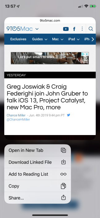
You can access a new previewing interface with a long-press, the replacement for the 3D Touch Peek. For example, long-pressing a link in Safari now displays a small window preview of the link’s destination with various actions below. If you are on iPad, long-press also activates Drag and Drop interactions. If the Peek is visible, you can just keep dragging to cancel the preview and continue with drag-and-drop.

All devices can now access quick action shortcuts from the home screen by long-pressing on an app icon: long-press an icon and let go when you feel the vibration to show them.

The new Peek interface in iOS 13, available by long-pressing on links and images.

The drawback to the iOS 13 behavior is that the advantages of 3D Touch are essentially left on the cutting room floor. You can no longer press harder on the screen to commit the preview and ‘pop’ the new navigation into place. You can no longer press firmly on an app icon and select a quick action in a single action without releasing your finger from the screen.

Rich notification previews work like the iPhone XR across every device now: you have to long-press down and then release for the preview to display. 3D Touch enabled these actions to be faster to do and simpler to execute. iOS 13 removes that speed and convenience.

The only place where the pressure sensitivity of the 3D Touch screen appears still to be used is on the Torch and Camera buttons available on the iPhone Lock screen, and activating the trackpad mode on the system keyboard (on non-3D Touch devices, you must long-press on the spacebar to activate this mode). Everywhere else, the equivalent 3D Touch interactions are slower and not as sleek as they were.

It’s a mixed bag. There’s now consistency across iPhone and iPad for the first time and Apple’s cheaper iPhone models like the iPhone SE and iPhone XR can now use features that were previously off limits. That being said, there is a definite regression in fluidity and functionality for 3D Touch iPhones.

Apple is clearly laying the groundwork in iOS 13 to ship a flagship iPhone later this year, which will lack a pressure-sensitive screen.

MacStadium Private Cloud for Mac

Check out 9to5Mac on YouTube for more Apple news:

Let's block ads! (Why?)


https://9to5mac.com/2019/06/05/3d-touch-ios-13/

2019-06-05 13:29:58Z
CAIiEPotQeRRUJG9n4dKzW-Qoi0qFggEKg0IACoGCAows4UBMMAaMJTJxgU

iPadOS makes Apple's tablet (almost) the computer I need - CNET

ipados-app-split

iPadOS adds some key features, including multiple windows in the same app.

Scott Stein/CNET

I'd love to take an iPad around as my main work machine. I've come close. But I haven't crossed over. The 11-inch iPad Pro is a fantastic piece of hardware. The limits? The software.

Apple's newly renamed iPadOS is a commitment to the iPad platform as a distinct thing from iOS on the iPhone. But it's already been that way: Many key iPad features aren't on the iPhone. With iPadOS, the distance between the two is growing. The iPad's getting some serious tools that will let it handle some of my biggest work needs.

"iPad is a growing platform again, which is pretty awesome," Apple's Greg Joswiak, said of the iPad platform right now. Craig Federighi told CNET, "It's become a truly distinct experience."

And yet, it's not entirely made the moves I expected.

ipados-browser

Browsing in Safari in iPadOS promises to finally allow Google Docs to work properly.

Scott Stein/CNET

Desktop-class browser: Is it a Chromebook now?

A full page of Google Docs, menus and markups and everything intact is what I'd expect. Working in my company's CMS to file a story is important. I haven't been able to do this well on an iPad before, but Safari promises, at last, that web pages will look like real web pages.

This isn't magic: Chromebooks and Chrome tablets do it. Windows tablets do it. It's time for Apple to do it, too. This was one of the biggest things holding back the iPad for me. I can't wait to seriously give it a try.

But, to be clear, this still means I'd need to touch icons. Apple's solution for places where a mouse or trackpad "hovers" is to tap on an icon on the iPad, which will bring up a menu. Then you'll tap on it again. What if a menu is long, and needs to be scrolled through? Will it be easy? That remains to be seen. The iPadOS public beta in July will be the first great test run, and I can't wait to see how well it works.

Multi-touch gestures for editing: Will they make me forget a mouse?

There are some new pinching finger gestures in iPadOS that are made to help text editing feel better. In a document, you'd pinch some text to copy, and unpinch somewhere else to paste. Seeing these in action, they almost seemed like gestures I'd do with a HoloLens AR headset. On a tablet, will they feel intuitive, or weird?

Apple doesn't support a trackpad or a mouse in iPadOS yet, even though mouse support can be set up for basic clicking under Accessibility features. But Apple insists on fingers (and a Pencil) as the key editing tools for now. iPadOS is making a bet that I won't miss a mouse or trackpad. I bet I will.

And there's another problem with the odd gestures in iPadOS: as CNET's Stephen Shankland said to me in a conversation, they feel like "incantatory gestures." You have to know the special moves to pull them off.

More split-screen apps and easy-glance widgets, but with limits

Multitasking on an iPad looks to be better, thanks to apps now having multiple windows open at once. In theory, Google Docs could allow two windows, if Google Docs chooses to update its iPadOS app. But the number of windows, or split-pane apps, is still limited by the iPadOS design. It's still two panes or apps at once, plus a hovering extra pane on top of that (Side View).

Widgets can be pushed onto the home screen now, something I've wanted for a while. The grid of apps get moved aside a bit to allow for them. Why not allow a full home screen to be customized, though? I'd prefer the grid of apps to be pushed out of sight completely. Do what the Apple Watch does: Have them appear with a gesture or a button. Or search for apps instead, which is what I do most of the time.

Mouse and trackpad support: Clearly the next step

What I really want? I've stated it months ago: An iPad that will let me easily edit and control things with a trackpad. A full laptop-like experience, like what I can do on a Google Chromebook or a Microsoft Surface. The iPad is not far from this idea. But there's no official way to use a trackpad in 2019.

Unless, that is, I choose to enable the iPadOS accessibility mouse support, which is clearly not going to satisfy my needs. That feature is intended to help people who can't use the touch feature easily. The mouse cursor is a big fat circle, not a small pointer. It only works as a single-click tool.

And yet it shows that iPadOS can support a mouse, if Apple only worked that support into all apps and features at an OS-wide level. I don't want just a basic mouse, though: I want a trackpad with multi-touch gestures. I want what a MacBook has.

So, Scott, you want a MacBook, not an iPad, you say. No, I want both. Apple needs to solve for both problems in one device. And that's not an unreasonable request. In fact, it seems like an inevitability. With Apple's ARM-based processors becoming more powerful, USB-C in iPads, Macs getting iPad apps, and iPads acting as plug-in touchscreens for Macs using Sidecar, the overlaps are already everywhere. 

Now playing: Watch this: Everything Apple announced from its WWDC 2019 keynote

1:26

Let's block ads! (Why?)


https://www.cnet.com/news/ipados-makes-apples-tablet-almost-the-computer-i-need/

2019-06-05 11:00:07Z
52780309521088

Apple just gave owners of older iPhones 4 great reasons not to upgrade to a new device (AAPL) - Business Insider

ios 13 wwdc performance upgradesiOS 13 will supposedly make apps launch faster, reduce the amount of space apps use up, and speed up Face ID unlocking.Apple

  • Apple is making some big announcements at WWDC 2019 about the iPhone performance improvements coming with iOS 13, the latest upcoming version of Apple's iPhone operating system.
  • iOS 13 will supposedly make apps launch faster, reduce the amount of space apps use up, and speed up Face ID unlocking. 
  • App launch speeds, storage needs, and Face ID unlocking speeds are great improvements that could stop you from buying a new iPhone because your current iPhone is too slow. 
  • If you're looking to buy a new iPhone because of battery life issues, you might exchange the battery instead and wait for the new iOS 13 to see if it breathes new life into your old iPhone, which would save you some cash.
  • Visit Business Insider's homepage for more stories.

Apple announced on Monday its upcoming version of the iPhone operating system — iOS 13 — that the company said will bring some key improvements to iPhone performance, at least those that will support iOS 13

With iOS 13, Apple claims your iPhone will launch apps faster, the amount of storage apps use up will be reduced, and Face ID will become faster, too. 

Apple's Craig Federighi didn't specify which iPhone models will experience these performance upgrades. But since the upgrades are coming to iOS 13, it's likely that all iPhones that support iOS 13 will reap the benefits of Apple's work over the last year.

Check out the performance improvements coming to iPhones running iOS 13, which Apple says is rolling out this fall:

Let's block ads! (Why?)


https://www.businessinsider.com/apple-ios-13-reasons-not-to-upgrade-your-iphone-2019-6

2019-06-05 10:00:00Z
CAIiECKEfdE-nmIuiPBnMk9lWewqLQgEKiUIACIbd3d3LmJ1c2luZXNzaW5zaWRlci5jb20vc2FpKgQICjAMMJD-CQ

Google Photos dark theme now rolling out independent of Android Q - 9to5Google

Over the past several weeks many first-party apps have gained dark modes, including Google Calendar and Keep just last month. The latest is now Google Photos, with users on non-Android Q devices notably seeing the darker theme.

Google Photos first received its dark theme alongside the system-level Android Q feature. Several Samsung and OnePlus users (via Reddit) on Android 9 Pie are already receiving the new look.

Google appears to be expanding the dark mode beyond Q devices to all users. On Pie, many are reporting that it respects the Developer option in settings, with no toggle in Photos to manually enable/disable. A similar situation applies to Google Drive where a dark theme is currently only available with Q.

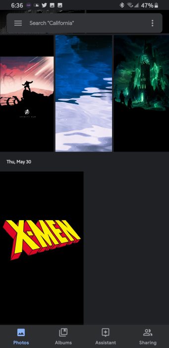
Like other Google apps, this particular look adopts a dark gray background rather than opting for full black. Both the search field (with merged status bar) and bottom navigation are slightly lighter than the main gallery background.

Given the contrast, your photos have tendency to pop and stand out more when scrolling. The look is thoroughly applied throughout Google Photos, including the navigation drawer, settings, and share sheet. Google Lens appears to be the only major exception.

The Google Photos dark theme is rolling out as a server-side update with the latest version of the app. While several users have the new look, it’s not yet widely available as of this evening.

Google Photos dark theme

More dark themes:


Check out 9to5Google on YouTube for more news:

Let's block ads! (Why?)


https://9to5google.com/2019/06/05/google-photos-dark-theme/

2019-06-05 07:00:32Z
CAIiEGSXRlIccg4LDMixpeIkJ2UqGQgEKhAIACoHCAowyoD5CjD5z-ACMM_rvwU